
• Home
  • about
  • Contact
Menu

Antipode Studio

  • Home
  • about
  • Contact

Antipode is a Melbourne research-to-design studio.

Directed by Dr Justin Westgate, a designer and human geographer; I work with public agencies, NGOs, universities and research institutes to understand their audiences, sharpen what they stand for, and turn important ideas into engaging communication. This includes:

Strategic design: Designing mission-focused pathways and outcomes.

Brand and identity: Purpose-driven narrative and design systems.

Communications and engagement: Developing high-impact audience touchpoints.

Find out more | Get in touch

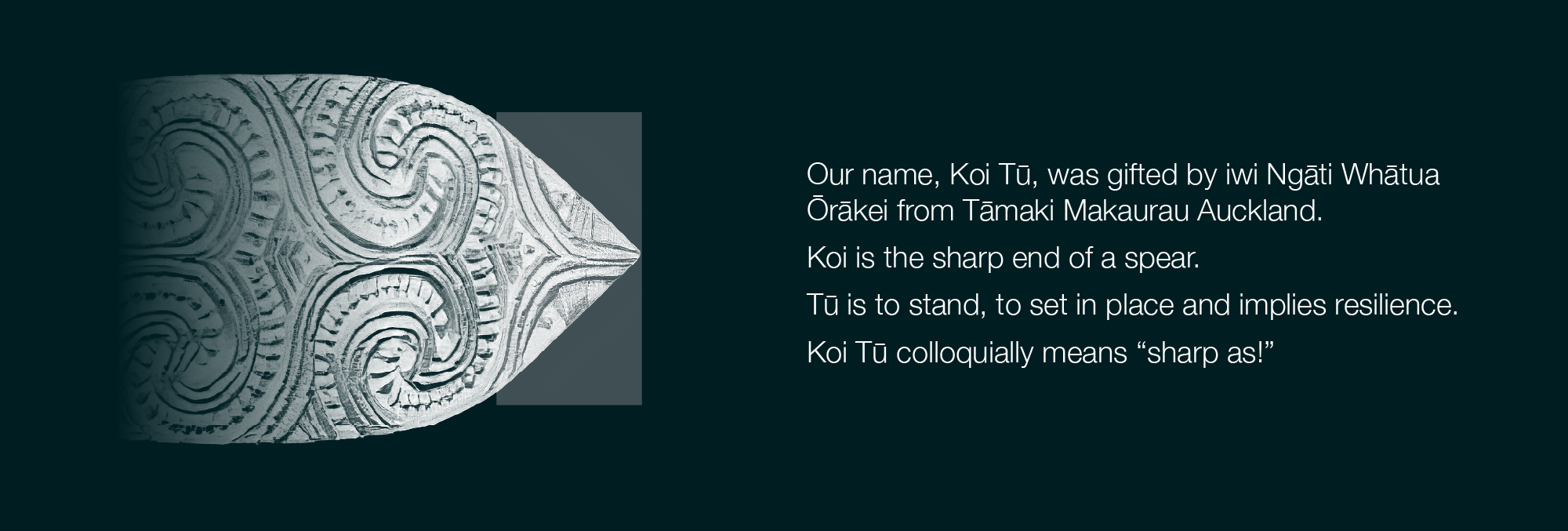
Koi Tū Trust

Client: Koi Tū Trust

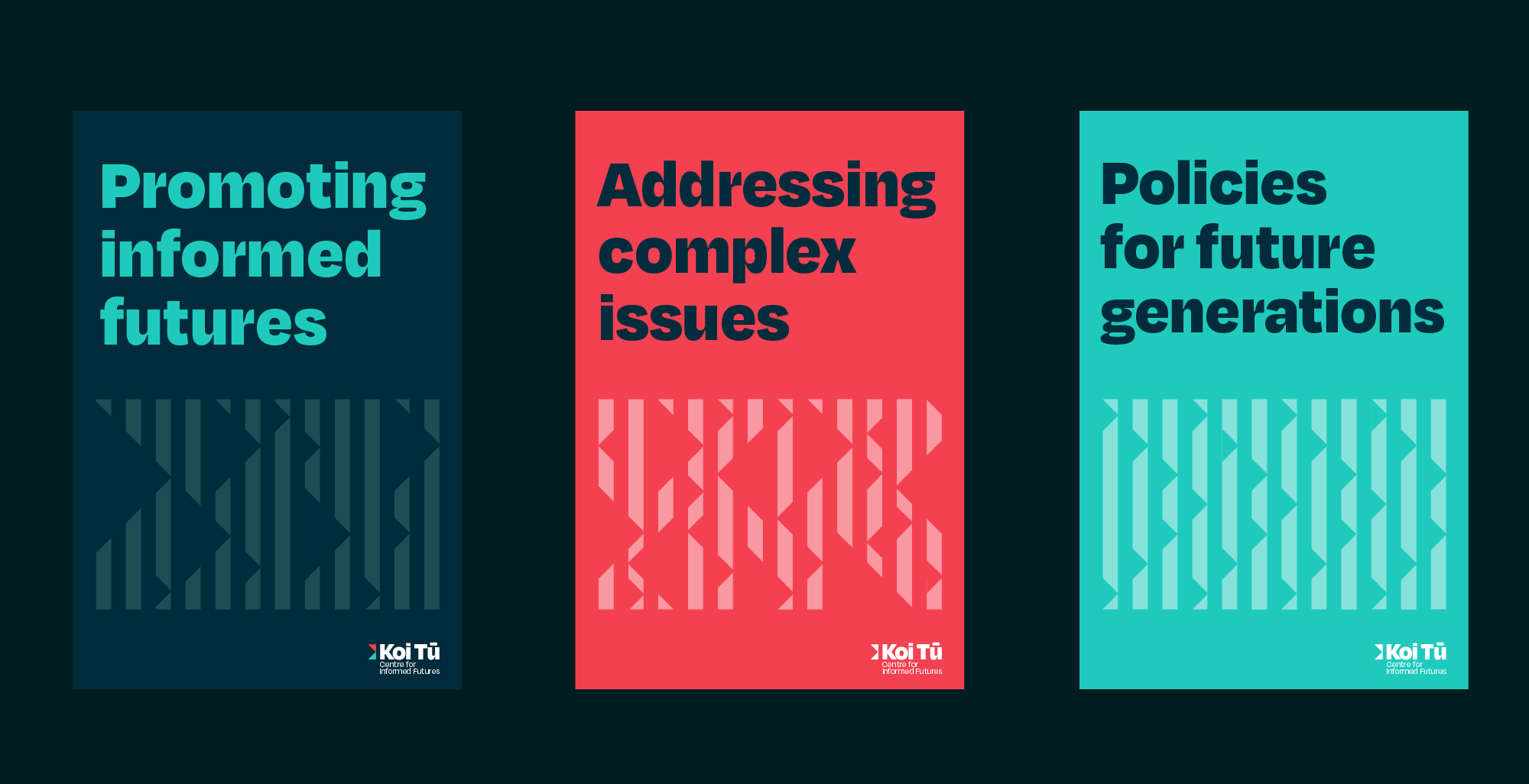
The challenge: Koi Tū Centre for Informed Futures is n independent think tank established by Professor Sir Peter Gluckman, focused on addressing critical, long-term global and national challenges. They required a comprehensive brand refresh and a scalable communications strategy to elevate their visual presence, ensuring their insights were delivered with authority and distinction across diverse media.

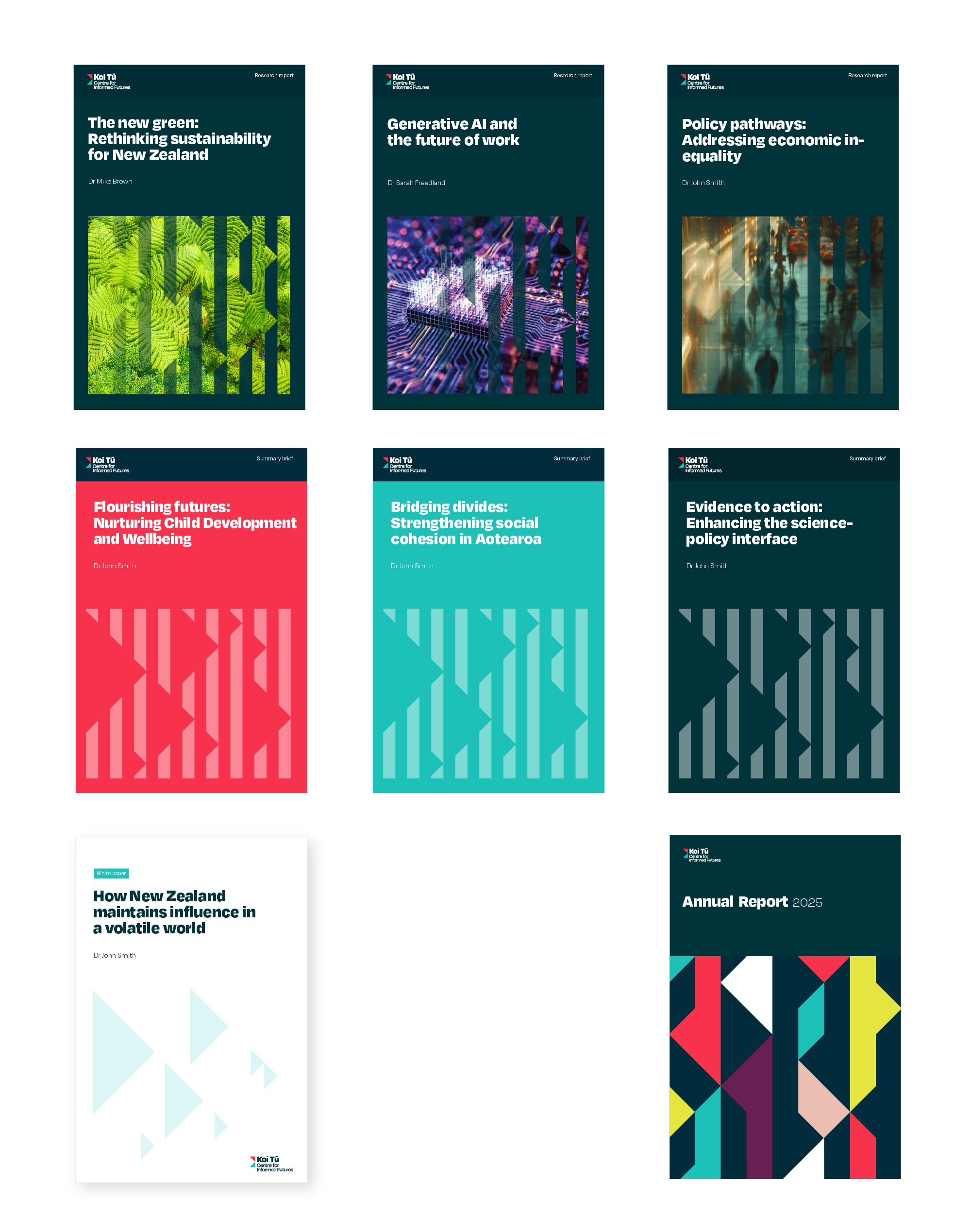
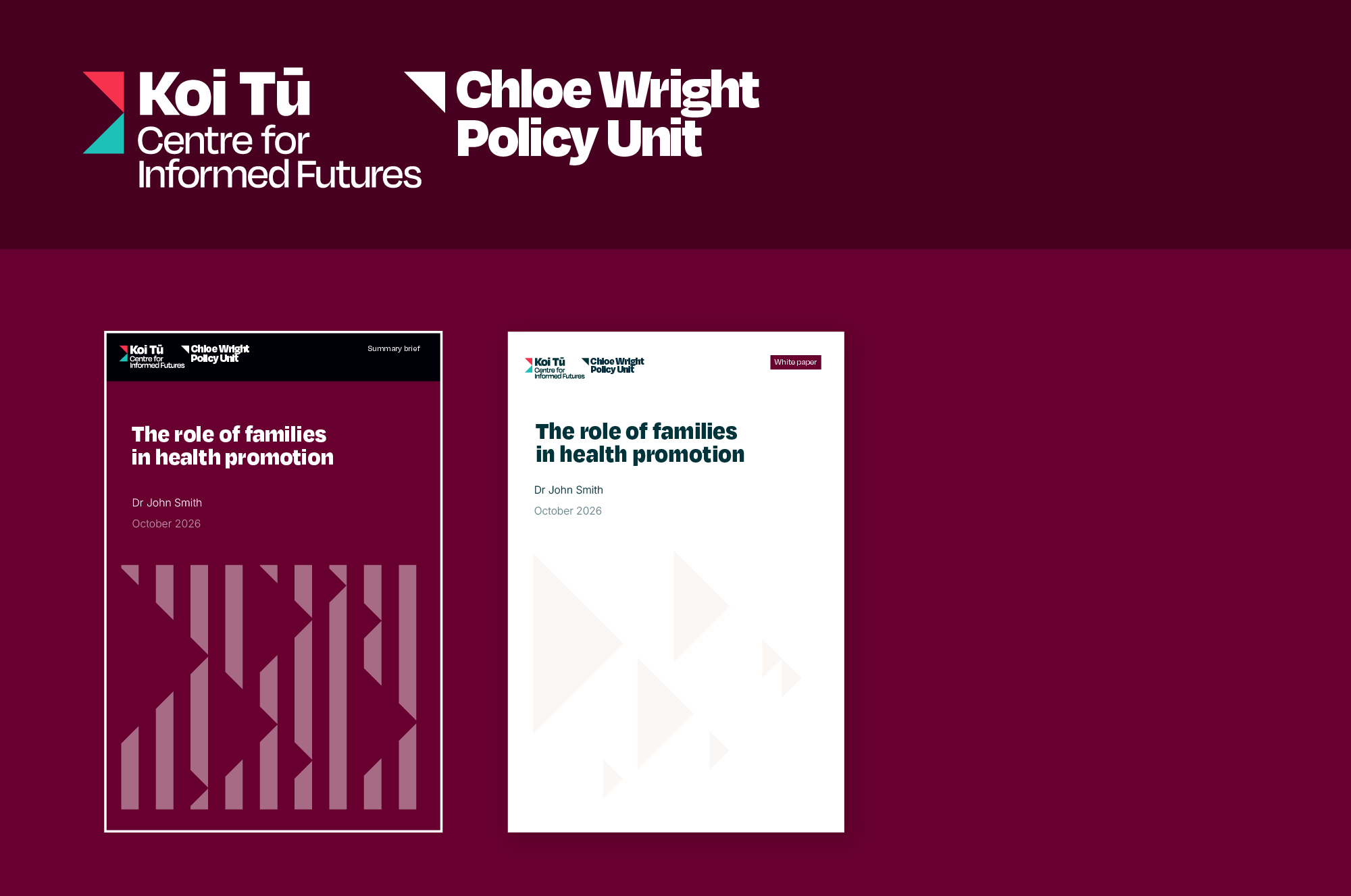
The Outcome: I designed a distinctive mark and visual identity anchored in the centre's name – Koi Tū means the "sharp end of a spear”, a metaphor for sharp, decisive insight. This drove the development of a bold and versatile brand language. The final deliverable provided a comprehensive suite of visual assets alongside modular print and digital templates, equipping the organisation with a robust design system for their ongoing publications.

The brand identity was a finalist in in the NZ Best Design Awards – NFP branding.

KTT NEW-02.png
KTT NEW-07.png
KTT NEW-03.png
KTT NEW-05.png
KTT NEW-06.png
CIF NEW-04.png

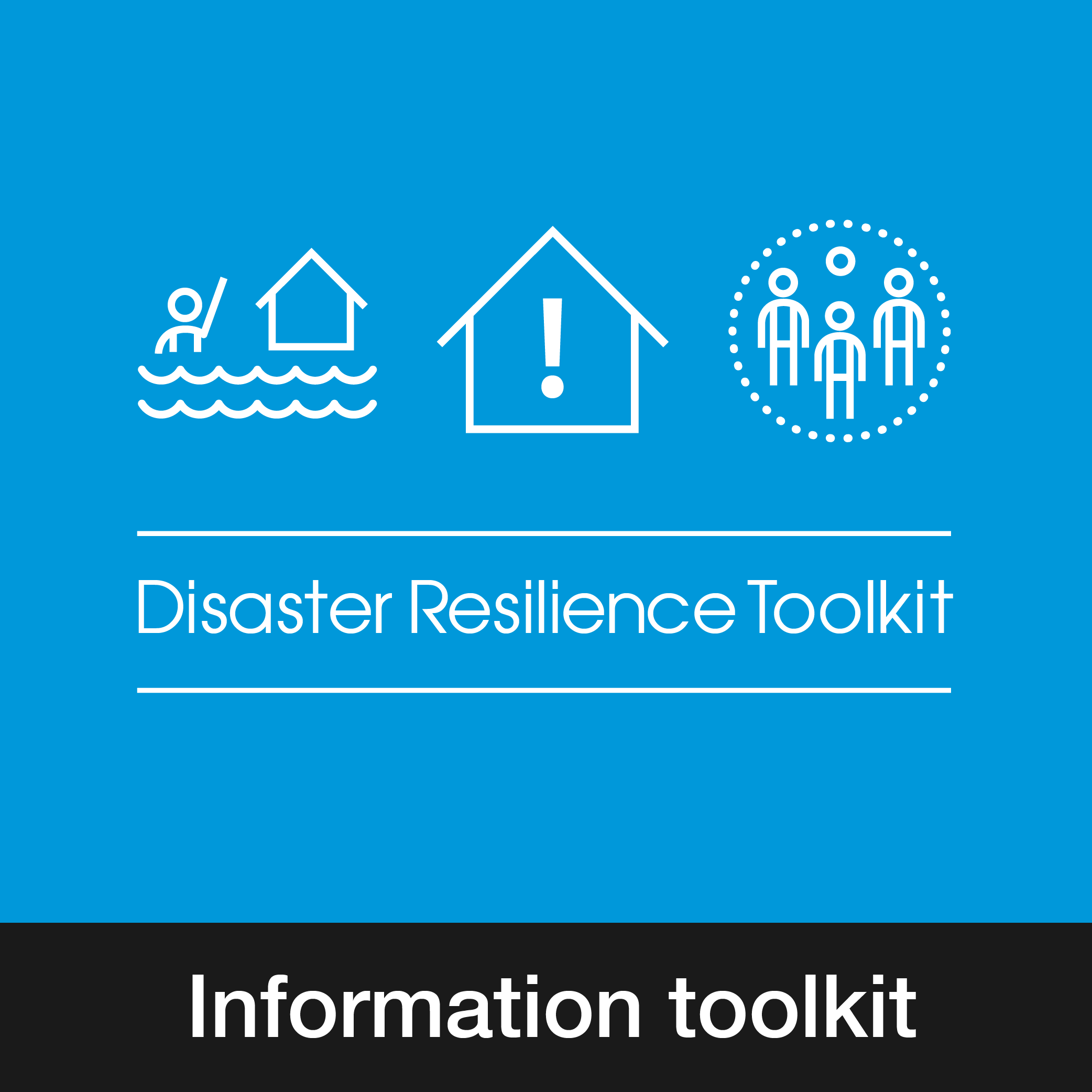
Disaster Resilience Toolkit

Client: University of Wollongong + community partners

The challenge: A University of Wollongong research project, funded by the Australian Research Council and the NSW Office of Emergency Management, had worked with people from refugee backgrounds in the Illawarra on disaster resilience, using a person-centred, co-learning approach. The research team and community partners had drafted a set of tools and needed help converting these into a resource community groups could pick up and use.

The outcome: I took the team's findings and draft tools and developed an easy-to-produce information toolkit, which included: a customised set of icons, activity templates and a 32-page booklet. The designs were tested with community groups during development to help refine them and ensure they worked effectively across a diverse user base. The toolkit was released as a free community toolkit.

RESIL_icons.jpg
RESIL_bk1.jpg
RESIL_bk2.jpg
RESIL_bk3.jpg
RESIL_info.jpg

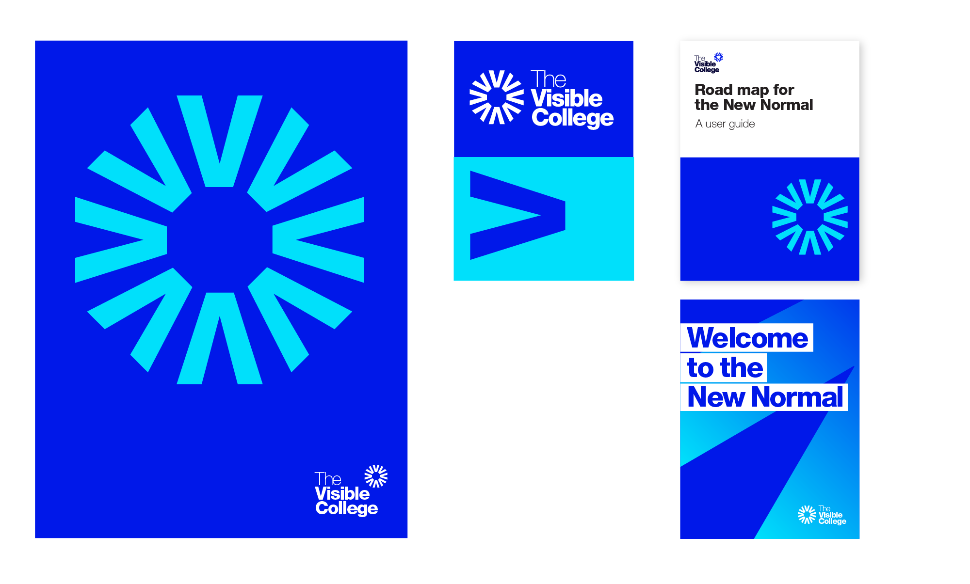
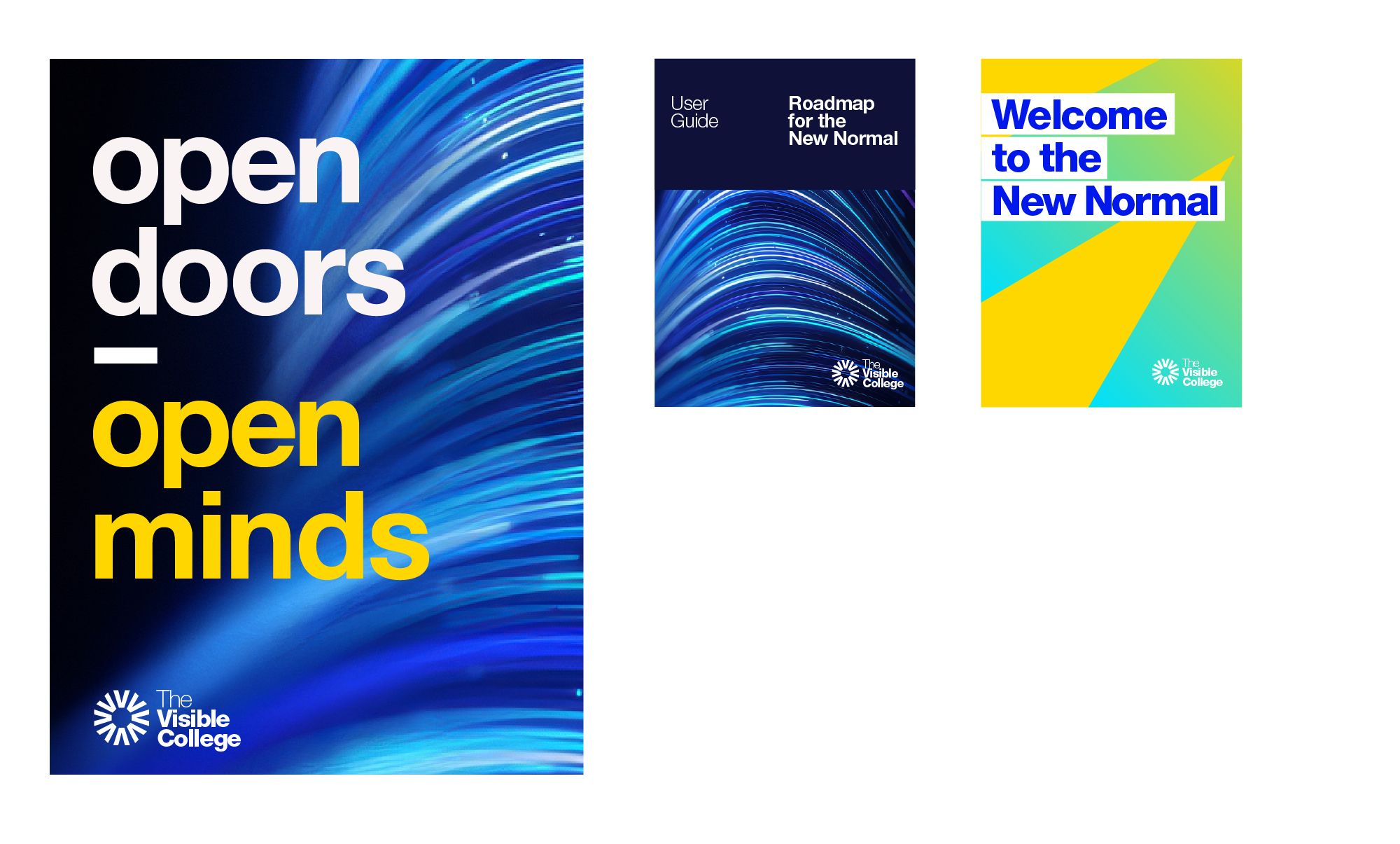
The Visible College

Client: The Visible College

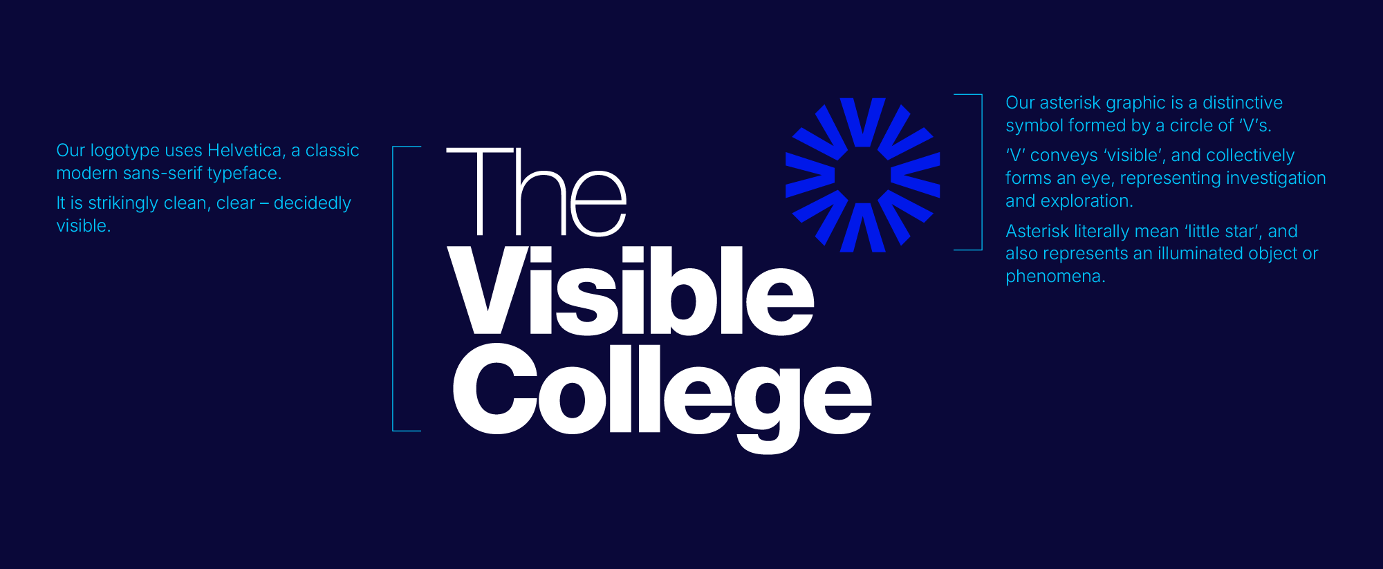
The challenge: The VC is an international research network dedicated to cross-disciplinary investigation of edge phenomena. They needed help with brand development. The visual system needed to be bold enough to establish a distinct presence, yet streamlined enough for distributed network members to implement consistently across diverse collateral without requiring ongoing design oversight.

The outcome: I designed a distinctive logo mark and modular identity framework. The work established clear typographic standards, cross-platform visual assets, and adaptable templates for both print and digital touchpoints – equipping the collective with an bold, self-sustaining brand system.

VIS COL-02.png
VIS COL-06.png
VIS COL-03.png
VIS COL-04.png
VIS COL-05.png

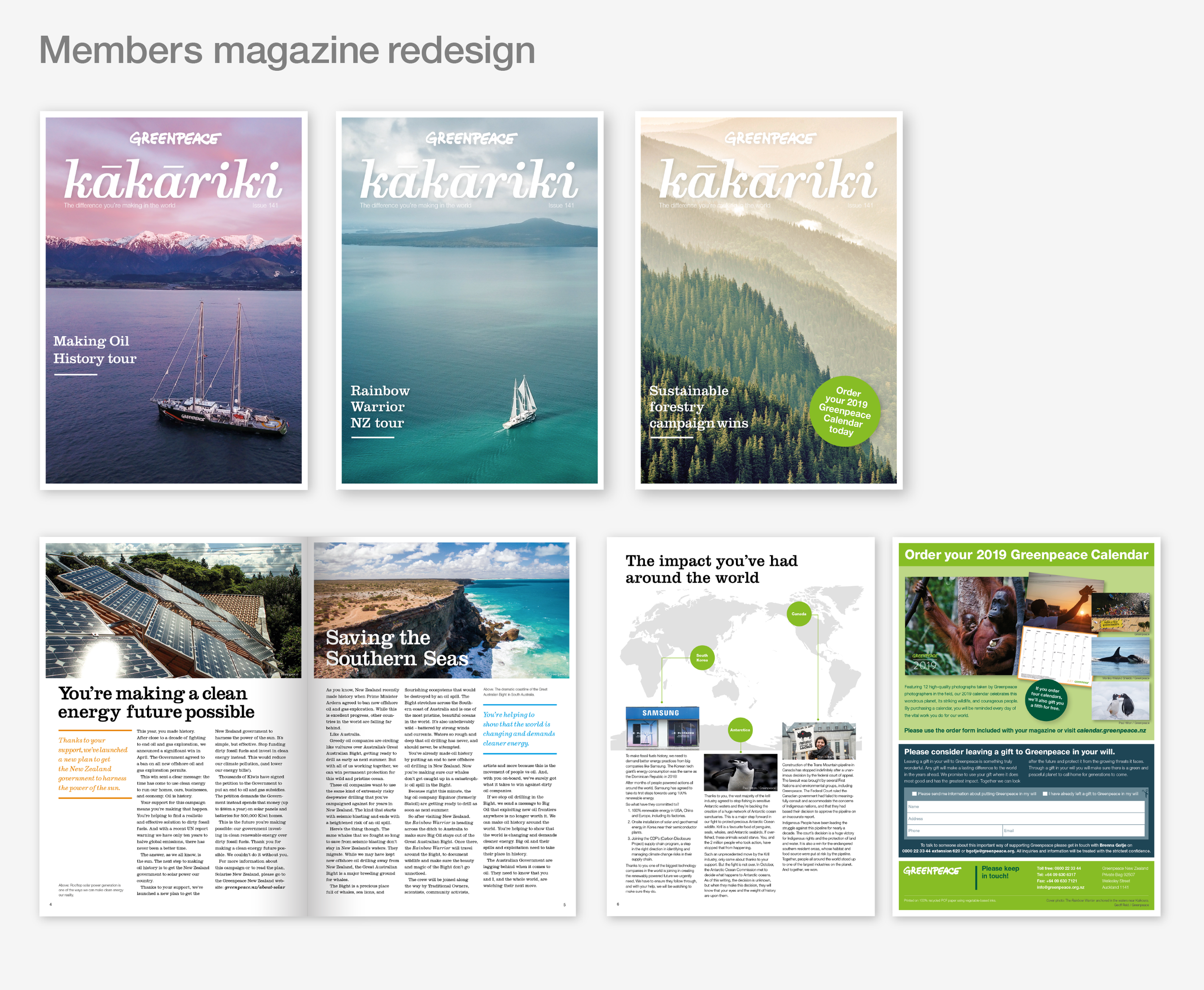
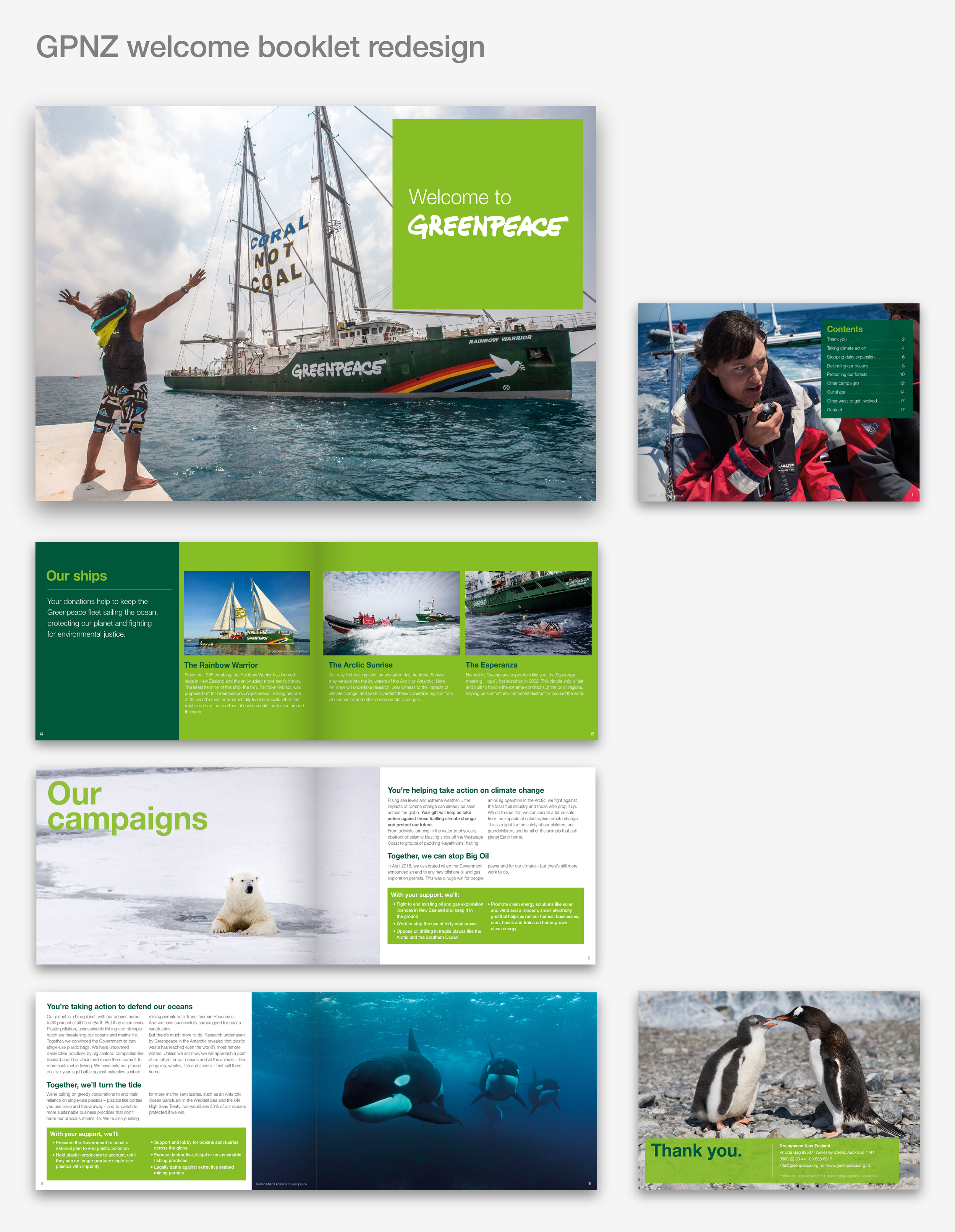
Greenpeace NZ

Client: Greenpeace NZ

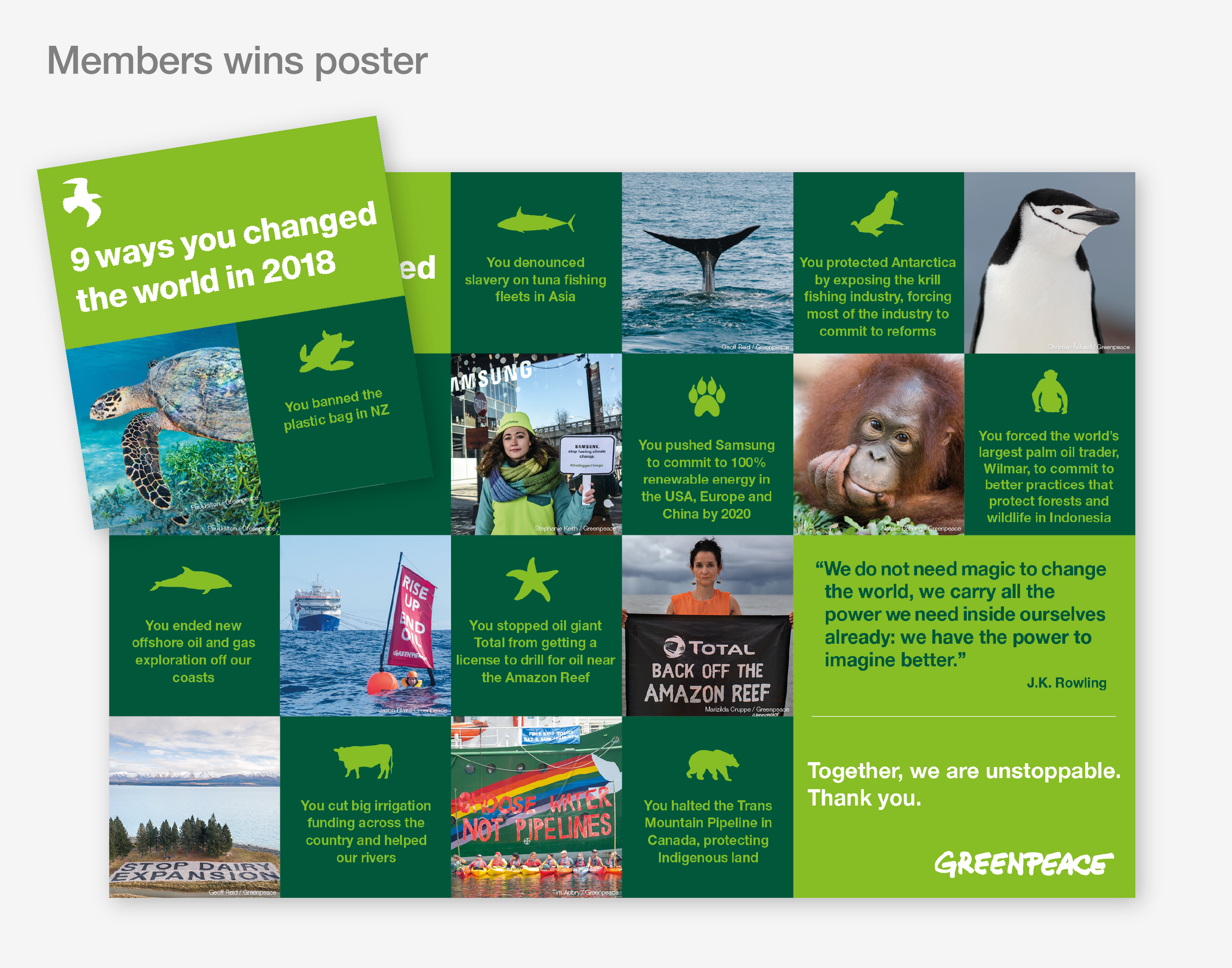
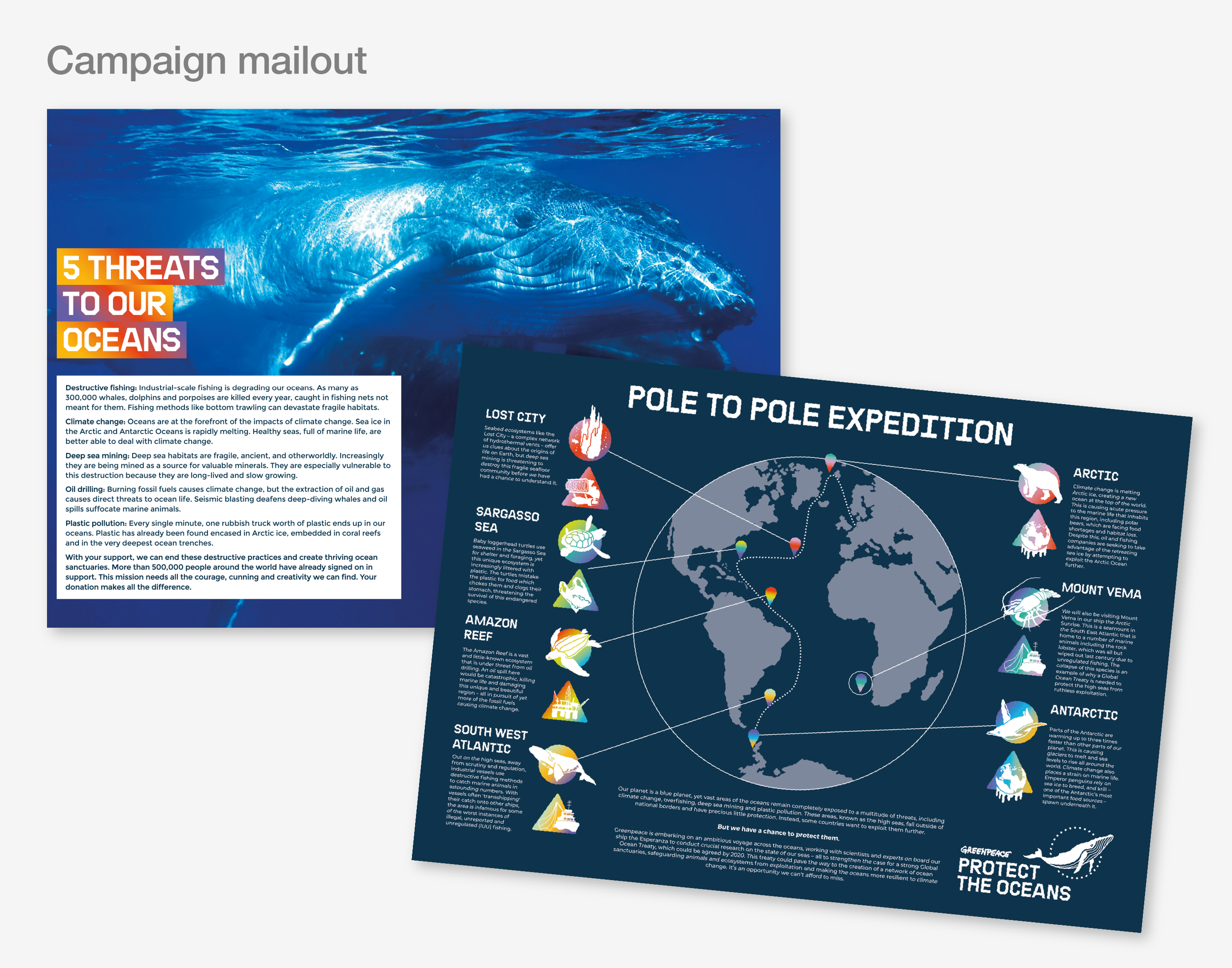
I have worked with Greenpeace on numerous projects over the years - most recently helping to revise member communications and publication strategy.

The challenge: Greenpeace NZ needed to update and revise a suite of comms. This included a range of core member communications such as their magazine ‘kakariki’, and campaign materials. Core materials needed to follow the global Greenpeace brand, while others required infusion of a ‘local’ feel.

The outcome: I worked with comms and campaigns managers to develop each item. The aim was to create clear branded communications, using GP’s high-quality images. I developed a versatile publication template for ongoing use, and I worked closely with the print supplier to test sustainable papers and inks, and deliver excellent print outcomes.

GP Mag-01.png
GP Mag-02.png
GP Mag-04.png
GP Mag-05.png

Government Advisory Groups

Client: NZ Government / MBIE / MoE

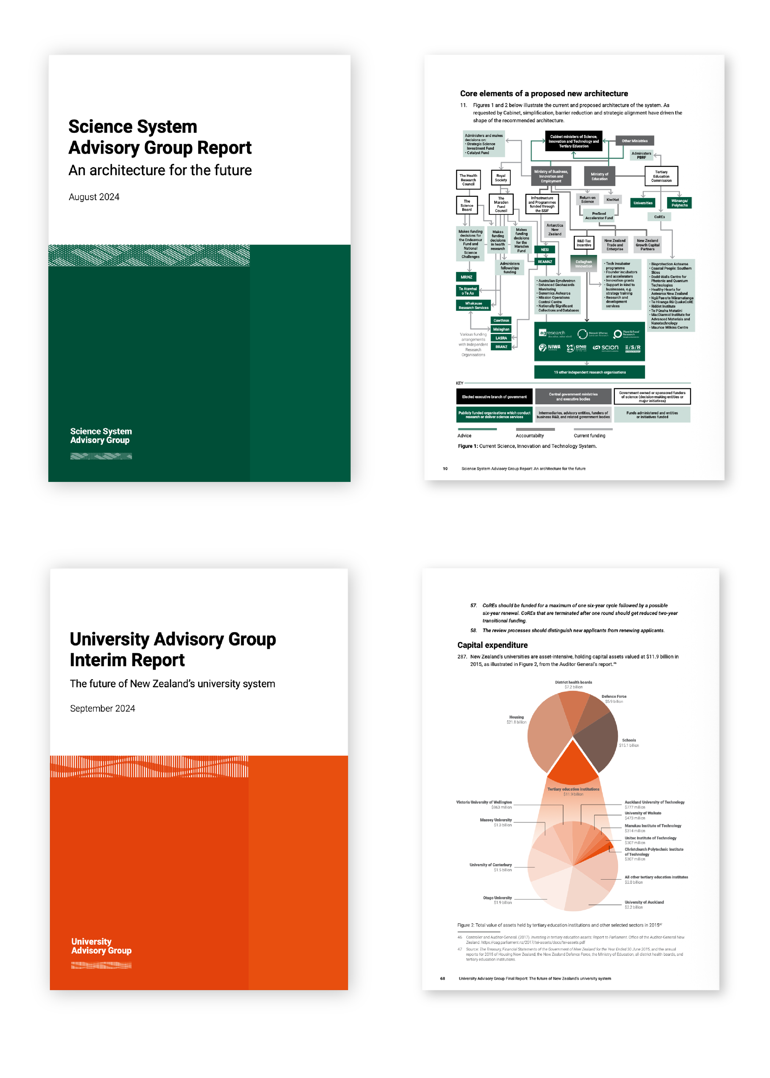
The challenge: The NZ Government initiated a review of two key sectors: the national science system and university sector. They required assistance developing online engagement platforms to capture public input, and then produce reports summarising the feedback and outlining system proposals.

The outcome: I developed a slick design approach for the projects, which ran across both web and reports. I produced two secure web platforms for public engagement, managed them over a 12-month timeframe allowing for multiple input stages. I produced multiple summary reports for public feedback.

AG project-01.png
GOV-01.png
AG project-02.png
AG project-04.png

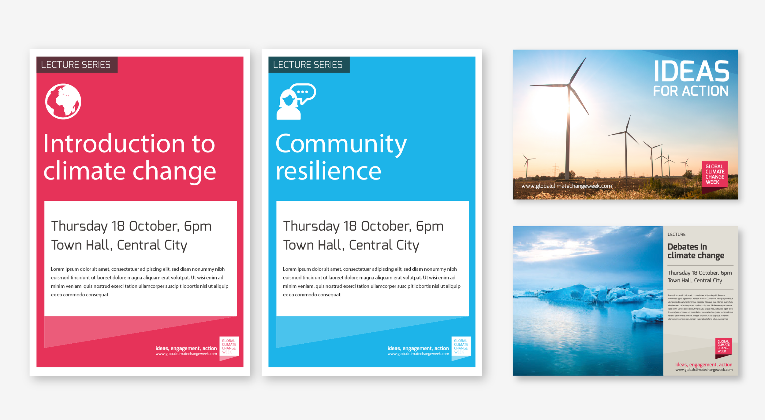
Global Climate Change Week

Client: Global Climate Change Week

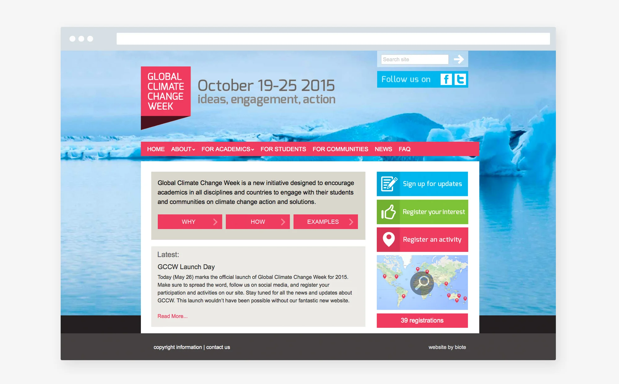
The challenge: GCCW was an Australian-led campaign encouraging academics globally to support the movement for stronger action on climate change. The campaign was minimally funded, and I volunteered my time to support it, helping to develop the campaign strategy, branding, and engagement platform.

The outcome: I developed simple but bold visual branding. The website functioned as a vital information portal where participants could learn more about the initiative and sign on to be involved. The interactive map enabled users to easily browse and connect with activities and participants in their local area.

The campaign mobilised over 300 initiatives in 51 countries around the world in it’s first year, and continue to run for the next 6 years.

GCCW_logo.jpg
GCCW_WEB-hm.jpg
GCCW_WEB-map.jpg
GCCW_info.jpg
GCCW-5.png

Being Brainy

Client: Brain Research NZ

The challenge: Being Brainy was an education programme intended to help students understand how the brain works. Developed by Brain Research NZ it comprised four sets of teaching resources, which included teacher files, presentation PowerPoints, and student activities. The client needed help both designing the toolkit and developing a web platform for user sign-up and delivery.

The outcome: I worked closely with the client to design the resources which were trialled through in-classroom testing before finalisation. A simple brand style was developed, incorporating a friendly brain character, who was employed to narrate aspects of the teaching resources. The toolkit and resources worked very effectively.

Being Brainy-02.png
Being Brainy-03.png
Being Brainy-04.png
Being Brainy-05.png
Being Brainy-06.png
Being Brainy-07.png
Being Brainy-08.png
Being Brainy-09.png

NZUni Talent

Client: NZUni Talent

NZ Uni Talent is nationwide careers service operated collaboratively by seven of the country’s eight universities. The service was rebooting and needed revised branding. We worked worked with the client to develop simple, bold and flexible branding system that can be effectively applied both online and across marketing material.

NZUT-02.png
NZUniTalent-03.png
NZUniTalent-04.png

Centre for Societal Resilience

Client: Centre for Societal Resilience – Te Toka Rinohea (NZ)

Te Toka is a proposed Centre of Research Excellence focused on enhancing Aotearoa-New Zealand’s resilience in the face of ongoing and rapid environmental, economic, technological and societal change.

Te Toka’s identity needed to align with it’s mission values, work effectively in local and international social and research contexts, and be visibly distinctive.

TE TOKA-02.png
TE TOKA-03.png
TE TOKA-04.png

Lead My Learning

Client: Early Start Research Institute / University of Wollongong

Lead my Learning is an Australian-based campaign focused on early-childhood learning, inviting parents and caregivers to become more active in turning everyday activities into learning opportunities. The campaign was a research project of the Early Start Research Institute, University of Wollongong, and was trialled in NSW, and developed using a participatory design process with local communities.

We assisted with the development of the campaign branding – taking the logo concept from artwork supplied by indigenous artist Johnno Johnson. This involved developing the visual branding strategy, and applying this across a range of collateral templates.

LML_logo.jpg
LML_brand.jpg
LML_poster1.jpg
LML_poster2.jpg
LML_poster3.jpg
LML_web.jpg

The Geographical Society of NSW

We worked with the Society to develop modern styling for its promotional collateral, and helped produce display items for the 90-year celebratory event. This included large-format banners and informational material.

GSNSW_logo.jpg
GSNSW-02.png
GSNSW-03.png
GSNSW-04.png

Te Punaha Matatini

Client: Te Pūnaha Matatini

Te Pūnaha Matatini is a New Zealand Centre of Research Excellence which uses complex data to develop new knowledge and insights about New Zealand’s environment, economy, and society.
We worked with them to extend their visual branding and develop a range communications items, including their annual reports. These key documents provide a compelling summary the centre’s research activity and impact.

TPM AR 2022-B-02.png
TPM AR 2022-03.png
TPM AR 2022-07.png
TPM AR 2022-04.png
TPM AR 2022-05.png
TPM AR 2022-06.png
TPM AR 2022-10.png
TPM AR 2022-08.png
TPM AR 2022-09.png
TPM AR 2022-11.png
TPM AR 2022-12.png

360 International

Client: 360 International / University of Auckland

360 is the university’s international exchange programme. We worked with them to develop creative collateral for a key promotions event, including display and digital formats.

UOA 360 event-02.png
UOA 360 event-04.png
UOA 360 event-03.png

UoA Signage

Client: University of Auckland

The University signage required updating to bring it in line with revised branding. We were contracted as lead design consultancy on the project, working with University stakeholders as well as external fabricators to develop an effective solution. The signage update also included developing criteria for bilingual language application, reflecting the University’s committment to cultural diversity.

The project covered both internal and external wayfinding, resulting in the development of detailed application guidelines for the revised system.

UOA Signage-02.png
UOA Signage-03.png
UOA Signage-04.png
UOA Signage-05.png
UOA Signage-06.png

Papakura Museum

Client: Papakura District Council / Papakura Museum

Papakura, a district just south of Auckland, played an important role in the history of New Zealand acting as a gateway to the rest of the country. The local district museum received funding to be relocated and redesigned, which involved a complete overhaul of the public exhibition.

The project involved developing an interpretive display style sympathetic to the interactive nature of the collection, as well as being easily accessible to museum audiences – largely young and the elderly. We worked closely with museum curators, the exhibition designer and council staff to develop almost 100 meters of exhibition display. This involved the scanning and retouching of approximately 100 historic images and documents. Managing the production involved working with the signage fabricator to deliver and install the display to an extremely tight deadline.

The internal building refit undertaken by Jasmax Architects, and including the internal museum exhibition, received a Bronze Award at the NZ Best Awards.

PMUS_logo.jpg
Papakura2-02.png
PMUS_p2.jpg
PMUS_p1.jpg
PMUS_p4.jpg
PMUS_p3.jpg
PMUS_p5.jpg

Love collective

Love: Art, ideas, music, politics (Australia)

The ‘Love’ project is community-based collective exploring philosophical, creative, and political themes of love. Activities included an open reading group and multiple community-focused events which culminated in multi-day festivals. These comprised varied workshops, which included group discussion, shared activities, and performance.
Justin served as a collaborator, working with the organising committee and helping with communications.
The ‘Love’ book documents outcomes of the project, housing a compilation of essays, songs, poems, and activities, for which we provided design and production expertise.

LOVE-02b.jpg
LOVE2-03.jpg

NZAP

Client: New Zealand Association of Psychotherapists

NZAP’s identity and website needed modernising. We lead them through a consultative process, refreshing their existing logo while retaining core legacy symbolism. At the same time we worked with the Waka Oranga Maori psychotherapists grouping to develop aligned branding that allowed the two identities to work together.

The member website was fully redesigned and restructured. Using a combination of WordPress and Wild Apricot, we expanded the site’s functionality and enhanced user experience, making it a much more useful and friendly site to use.

NZAP-01.png
NZAP-05.png
NZAP-02.png

High Value Nutrition

Centre for High Value Nutrition

HVN is a multi-million dollar government-funded research grouping (NZ National Science Challenge) with a focus on nutritional health. The centre required visual brand development, as well as production of basic communications collateral. We developed a simple modular style that could be easily templated and subsequently managed by the comms officer.

HVN-02.png
HVN-03.png
HVN-04.png
HVN-05.png

Te Punaha Matatini

Client: Te Pūnaha Matatini

Te Pūnaha Matatini is a New Zealand Centre of Research Excellence which uses complex data to develop new knowledge and insights about New Zealand’s environment, economy, and society.

We have worked with them to extend their visual branding and develop a range communications items, including their annual reports. These key documents provide a compelling summary the centre’s research activity and impact.

TPM_front.jpg
TPM_spread1.jpg
TPM_spread2.jpg
TPM_spread3.jpg
TPM_spread4.jpg
TPM_spread5.jpg
TPM_spread6.jpg
TPM_spread7.jpg

Liggins Institute

Client: Liggins Institute

The Liggins Institute is a leading research centre based at the University of Auckland, which focuses on improving health through research into early-life events. We worked with them to produce promotional collateral aimed at attracting post-graduate researchers.

Liggins-01.png
Liggins-02.png
Liggins-03.png
Liggins-04.png
Liggins-05.png

Connected Media

Client: Connected Media Trust

Connected Media’s mission was promoting awareness of sustainability through media. We helped the revise their branding, develop a web portal for their media products, as well as develop creative for the ‘outlook for someday’ youth media project.

ConnectMedia-02.png
ConnectMedia-03.png

Papakura Arts

Client: Papakura District Council

Papakura Arts was a council service promoting community arts and events. We developed visual branding which worked across a website portal and quarterly arts calendars.

Papakura Arts-05.png
Papakura Arts-02.png
Papakura Arts-03.png
Papakura Arts-04.png

Travelwise

Client: Auckland Regional Transport Authority

ARTA worked with The University of Auckland and AUT University to develop a campaign promoting sustainable transport use. Student participation was invited in its development, for creative ideas and installing ambient advertising. Promotions were run at key moments on campus – posters, display advertising, ambient street chalking as well as social media.

We coordinated the project: creative development, working with students to develop ideas and create final imagery; plan and manage the media run; coordinate the installation of ambient advertising; manage social media; produce an animated spot for the student television networks.

Travelwise-02.png
Travelwise-03.png
Travelwise-04.png

Diabetes Projects Trust

Client: Diabetes Projects Trust

Diabetes is a growing issue within Maori, Pacifica and immigrant populations. DPT works at a community level through a range of initiatives to promote more health-oriented lifestyle choices.

We’ve worked with the client over a number of years to develop resources for some of their initiatives. A series of posters were developed to promote health-positive behaviour for kids and work alongside engagement campaigns within schools. A short tv-gameshow drama was translated into a mini-comic to help kids learn about healthy eating. It was produced in multiple languages: English, Maori, Samoan and Tongan. Information leaflets were designed through community consultation and translated into languages such as Maori, Somali, Dari and Arabic.

DPT-02.png
DPT-03.png
DPT-04.png
DPT-05.png
prev / next
Back to Antipode Studio
KTT_SQ2.png
6
Koi Tū Trust
DRT_SQ5.png
5
Disaster Resilience Toolkit
VC_SQ4.png
5
The Visible College
GPNZ_SQ1.png
4
Greenpeace NZ
GOV-03.png
4
Government Advisory Groups
GCCW_SQ.png
5
Global Climate Change Week
BB_SQ2.png
8
Being Brainy
NZUT_SQ.png
3
NZUni Talent
TETOK_SQ.png
3
Centre for Societal Resilience
LML.png
6
Lead My Learning
GSNSW_FEAT.jpg
4
Geographical Society NSW
TPM AR 2022-B-01.png
11
Te Punaha Matatini
UOA 360 event.png
3
360 International
UOA SignageB-01.png
5
UoA Signage
Papakura-SQ5.png
7
Papakura Museum
LOVE-01.png
2
Love collective
NZAP-04.png
3
NZAP
HVN-01.png
4
High Value Nutrition
TPM_FEATSQ.jpg
8
Te Punaha Matatini
Liggins-06.png
5
Liggins Institute
2
Connected Media
Papakura Arts.png
4
Papakura Arts
Travelwise2-01.png
3
Travelwise
DPT-01.png
4
Diabetes Projects Trust

All content copyright Antipode Studio, or the respective owner